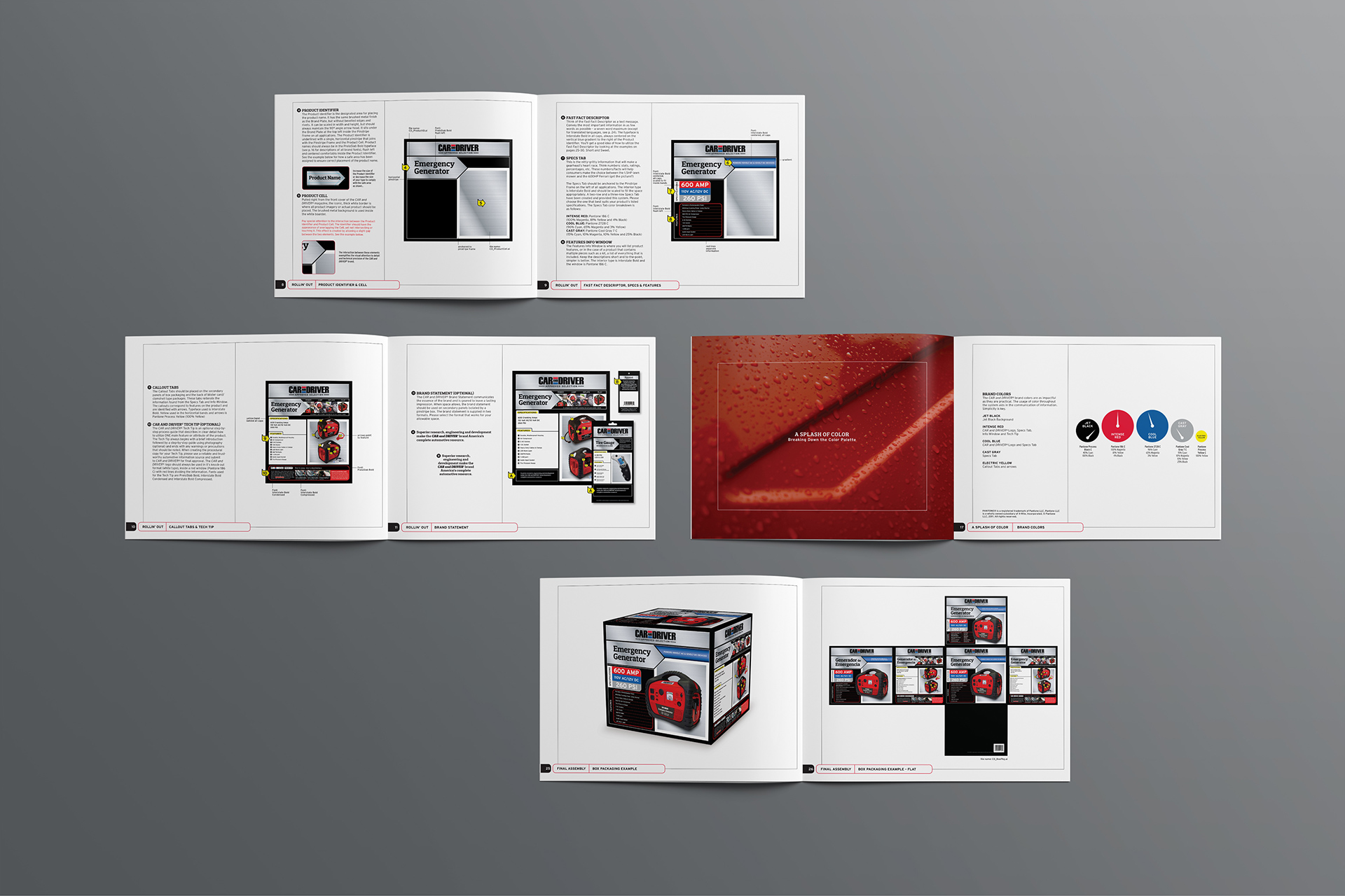
Packaging and Brand Guidelines for Licensed Products
Car and Driver magazine is one of the most recognized and well respected automotive publications on the planet. Their long-running history of honest, objective reviews has earned them an almost cult-like following from backyard mechanics and auto enthusiasts alike. Looking beyond the pages of the publication, Car and Driver needed an extension of their brand image for a line of practical and dependable licensed products.
Car and Driver wanted to position their products as being useful for the everyday driver, and if the product wore the Car and Driver name, it needed to deliver as promised. The on-pack information needed to be easy to understand at a glance, and in no way should the packaging aesthetics give the impression of being race-inspired or performance oriented. Pulling key visual cues from the magazine, and adding a few new ones, the overall look felt strong and relatable without being too technical for the average gas-and-go customer.
Brand Guidelines, Packaging Standards and Assets
Client Car and Driver
Design Agency Alternatives
Licensing Agency The Joester Loria Group
Services branding, creative direction, art direction, asset management


