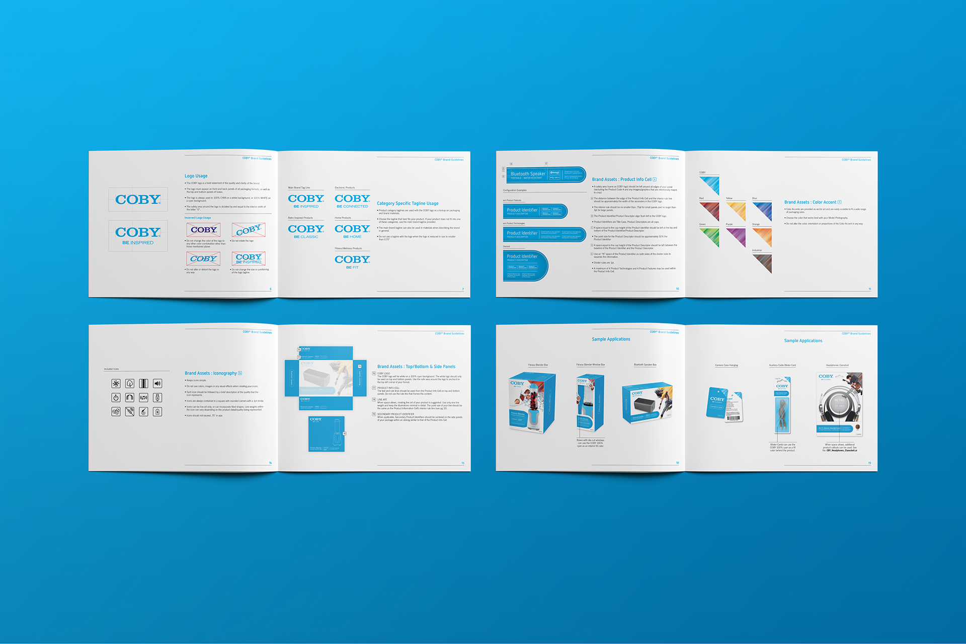
Packaging and Brand Guidelines
Coby Electronics markets its products to a value-minded consumer base. Their customers want functional products at a price point that doesn’t require the sale of a kidney. With many of their manufacturers doing the design and packaging of their products, it wasn’t unusual that the packaging designs were all over the map. Coby recognized this and needed to respond by providing their manufacturers and designers with a set of brand packaging standards.
I had always remembered Coby as the “other” electronics brand that would appear on the shelves of grocery store checkout lines or given away as raffle prizes. They were never the coolest, sexiest, or as feature heavy as the other big brands like Sony or Samsung. But, THAT WAS THEIR THING! They weren’t trying to be those brands, they were just making good, reliable products at a respectable price point that sort of flew under the radar. As part of their rebirth, they wanted to position themselves as a lifestyle brand. Coby would continue to deliver audio and video products, but now also home, personal care and lifestyle-focused electronics would be added to their portfolio. The new brand look for packaging reflects a clean, contemporary aesthetic that doesn’t feel pretentious or overly sophisticated—staying true to the brand message. Detailed packaging guidelines were needed for designers as well as manufacturers who do in-house packaging. To differentiate Coby’s portfolio of products, a tag line system was developed for each product category.
Brand Guidelines, Product Structuring Strategy, Packaging Standards and Assets
Client Gordon Brothers Group
Design Agency Alternatives
Services branding, creative direction, art direction, asset management


