Located in Southern California, the Men's Health Foundation visualizes men’s healthcare with honest, open dialogue between patient and doctor, asking their patients to be more proactive about their health so they can live longer, more productive lives.The Men's Health Foundation needed a brand language that was clean and masculine, yet cool and approachable, while unifying its larger network of organizations that included the Southern California Men's Medical Group (SoCalMMG), the Men’s Health Foundation Pharmacy, and Mill’s Clinical Research.
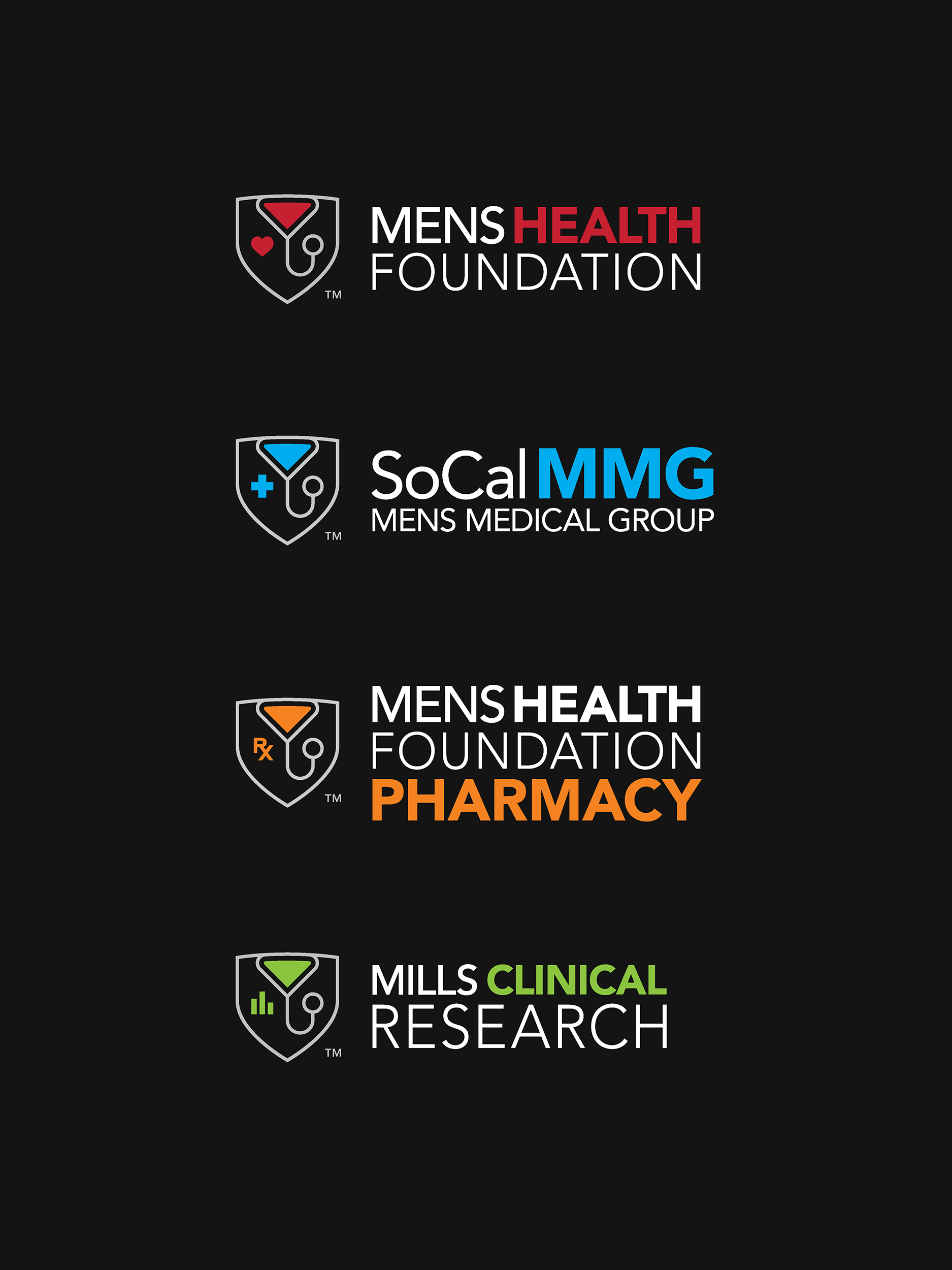
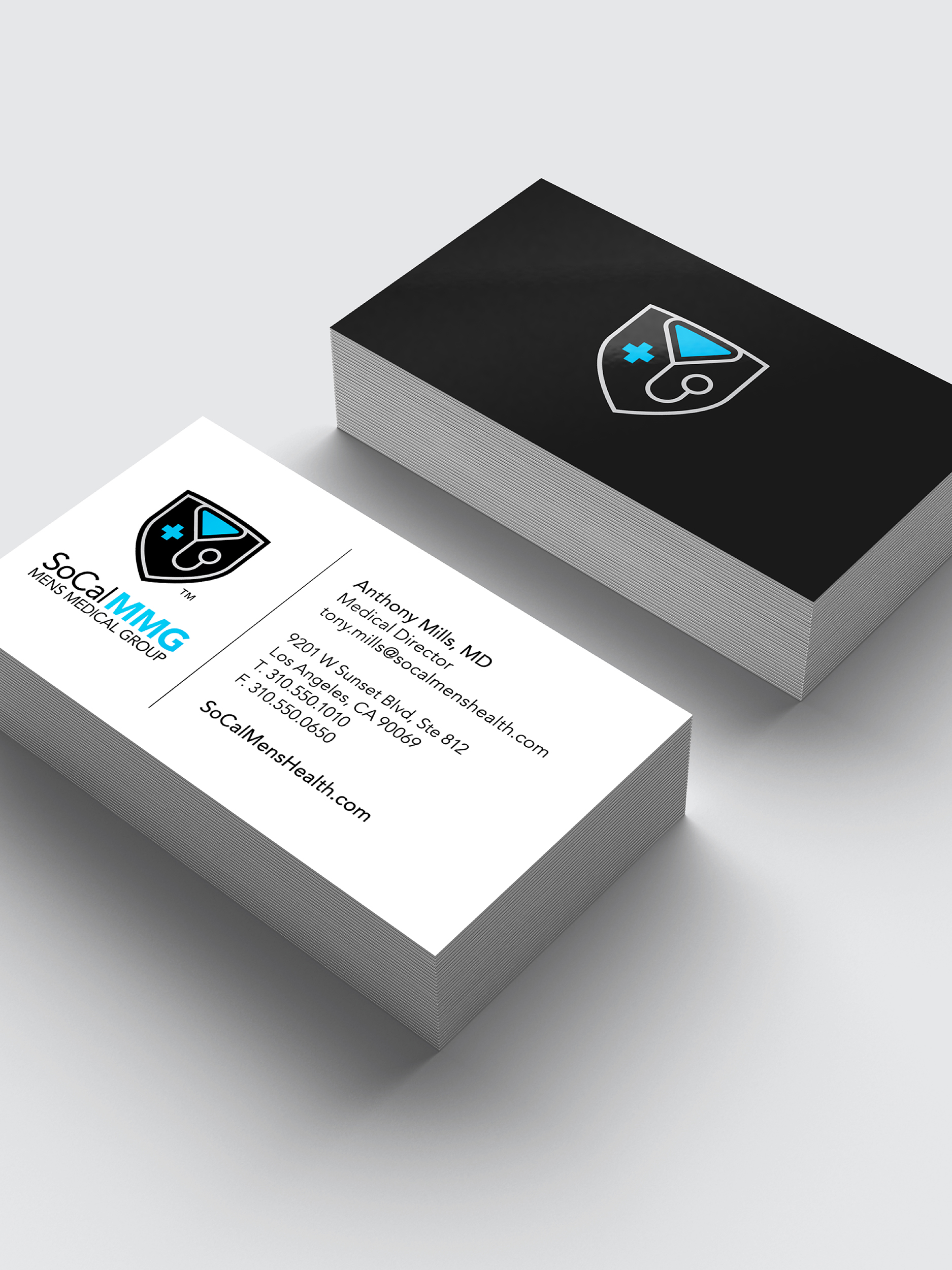
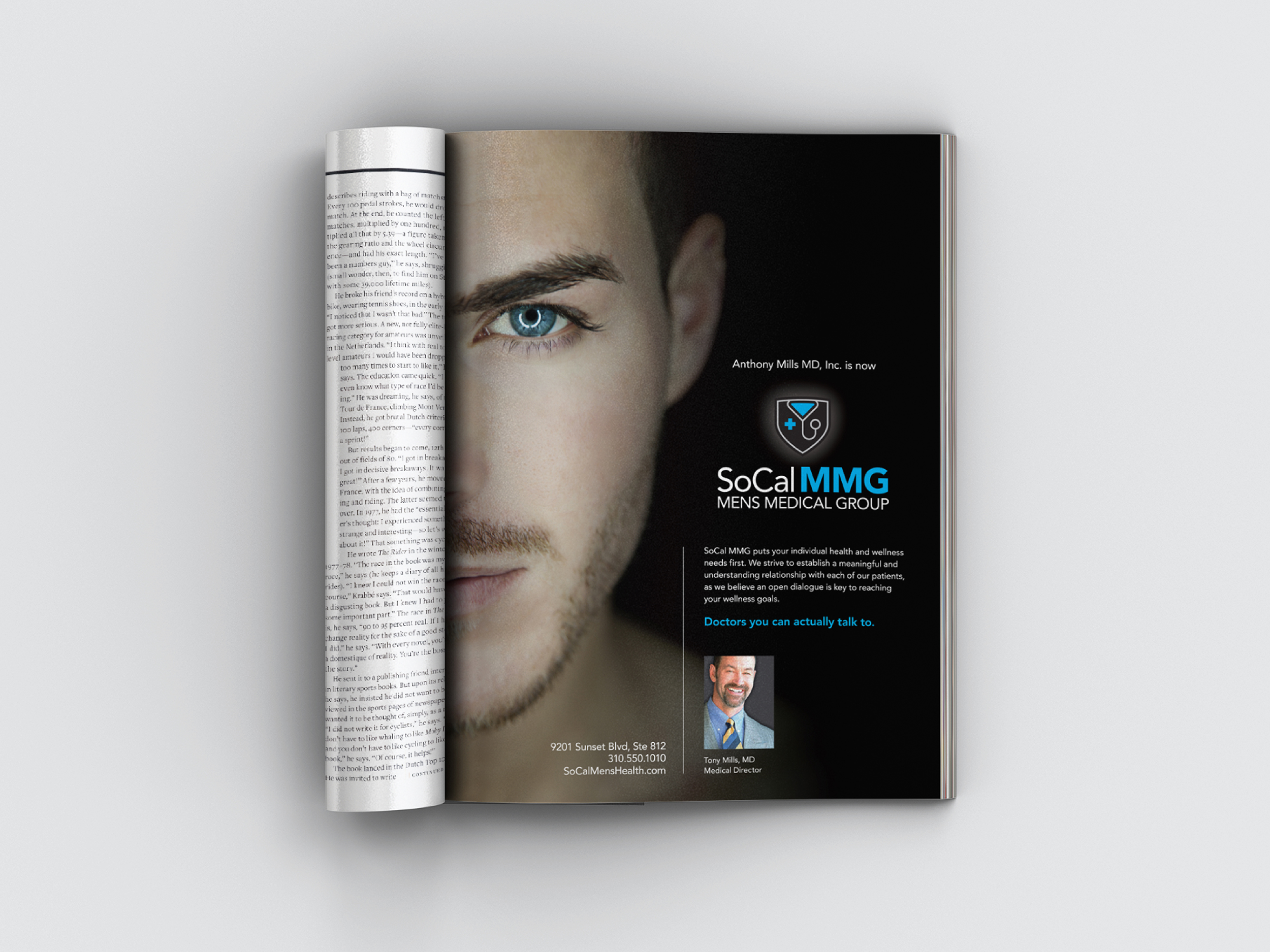
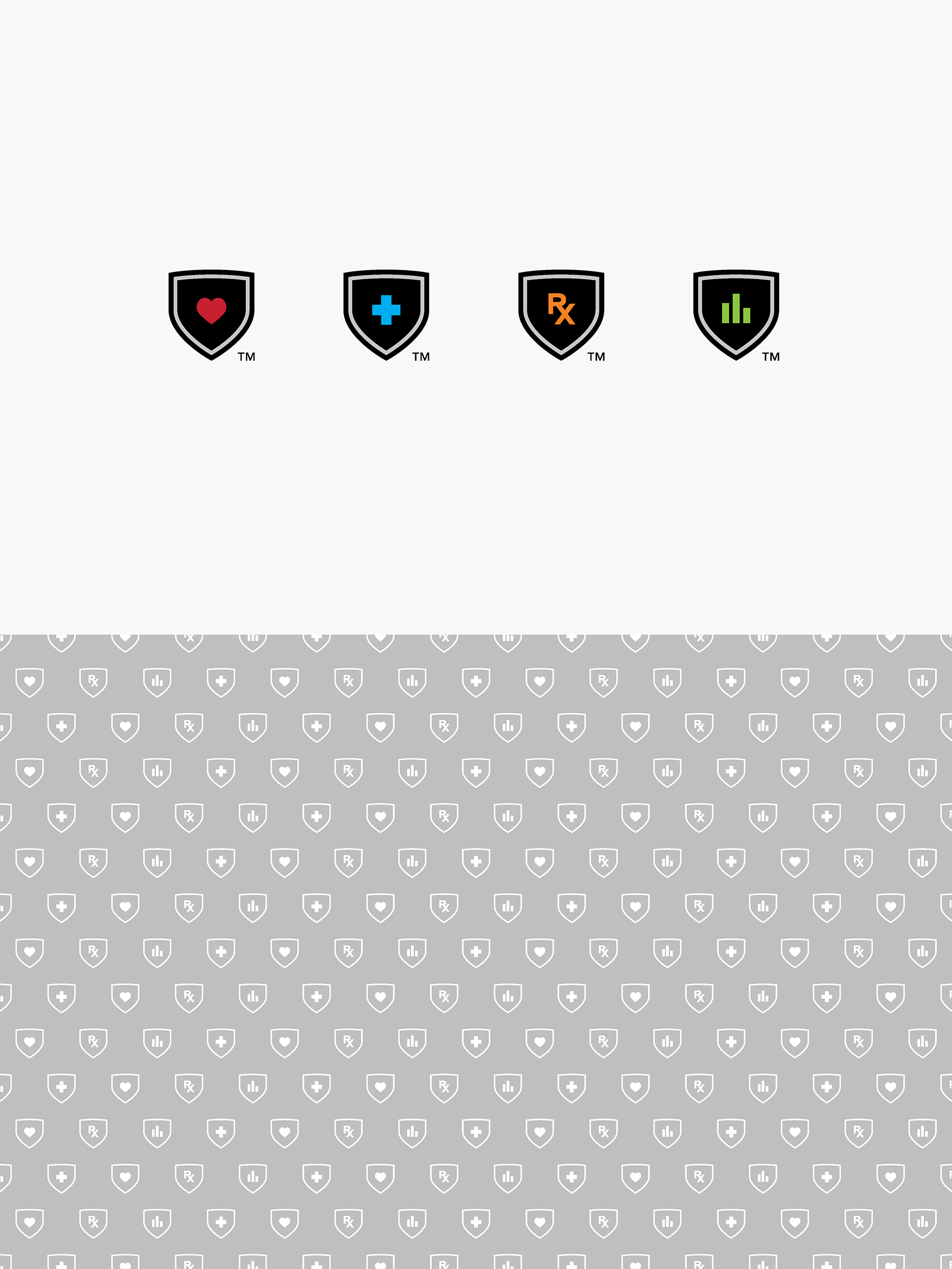

Located on Sunset Blvd, the Men’s Medical Group is not a suit-and-tie doctor’s office. The organizations needed to look sophisticated but laid back at the same time. A v-neck silhouette and vibrant colors inspired by the pride flag were implemented for each organization’s respective logo. The branding is clean, approachable, and unpretentious.
deliverables
Identity
Social Media Icons
Advertising Campaign
Promotional Items
Informational and Public Outreach Materials
Office Wayfinding System
services
identity design
brand design
advertising
art direction
creative direction
Client: Adam Tucker
Design Agency: Alternatives