Salon 10N is a holistic-forward salon that focuses on well-being and clean beauty. The salon only uses products that are safe for the stylists, their clients, and the environment.
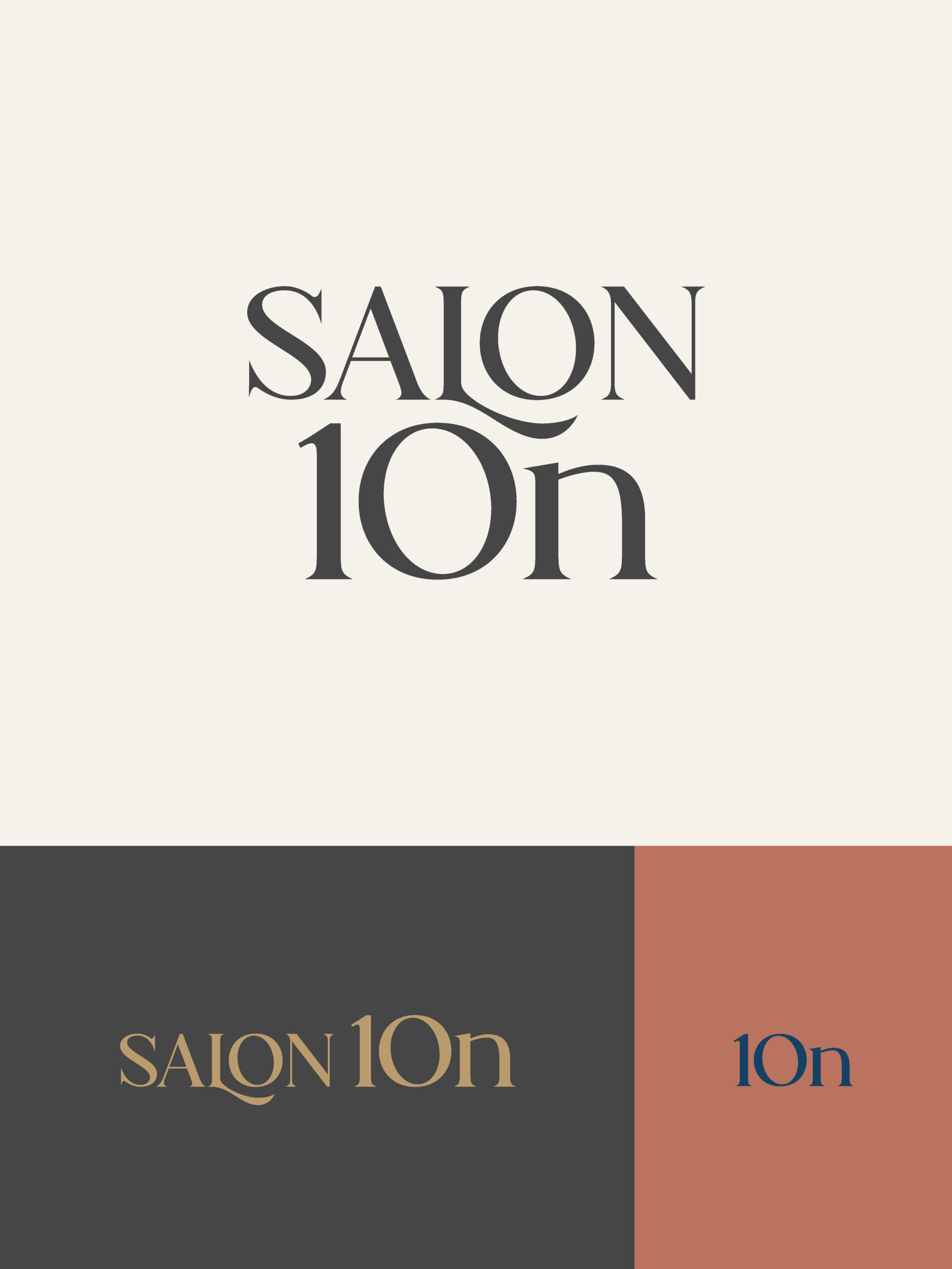
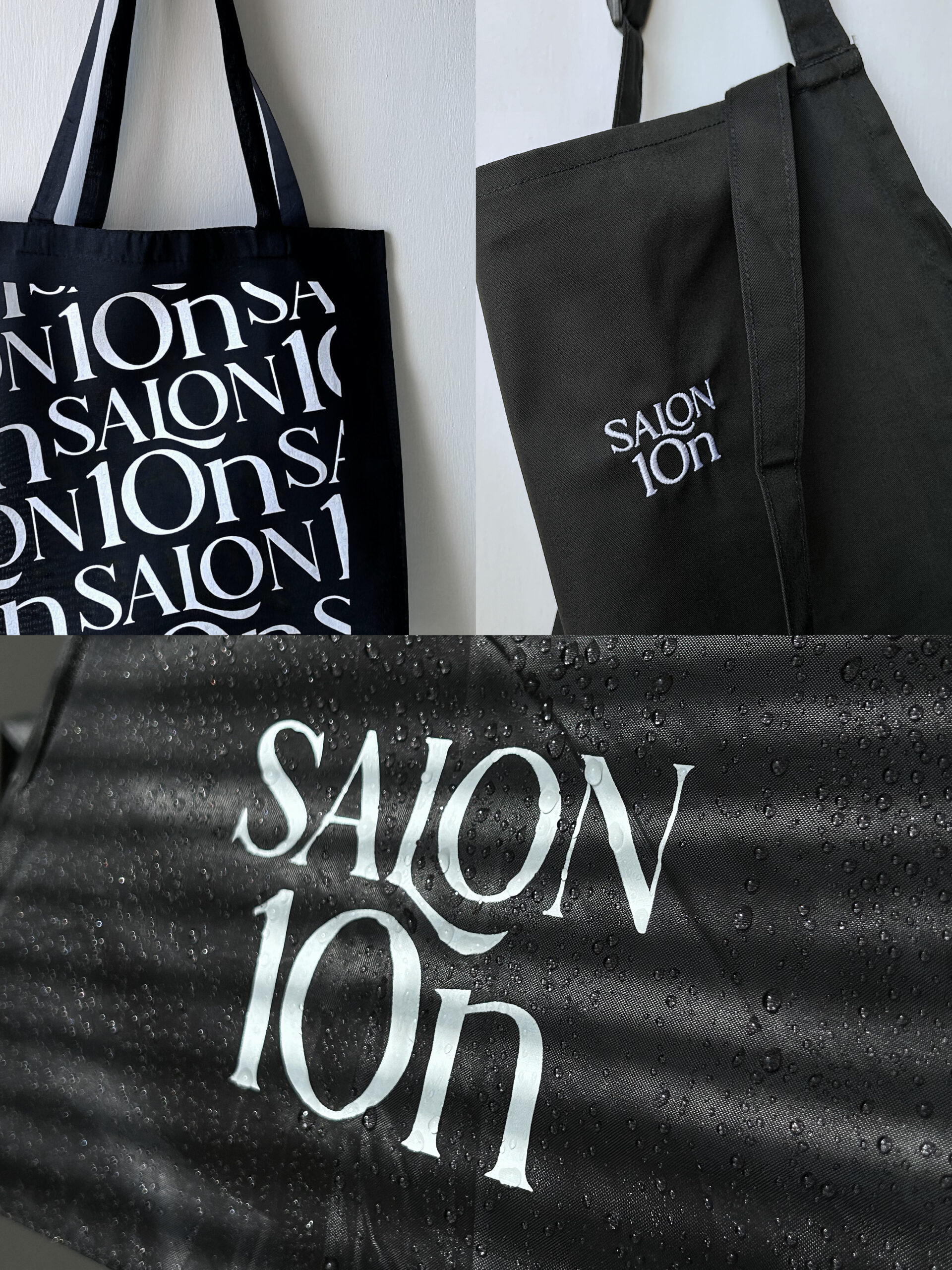

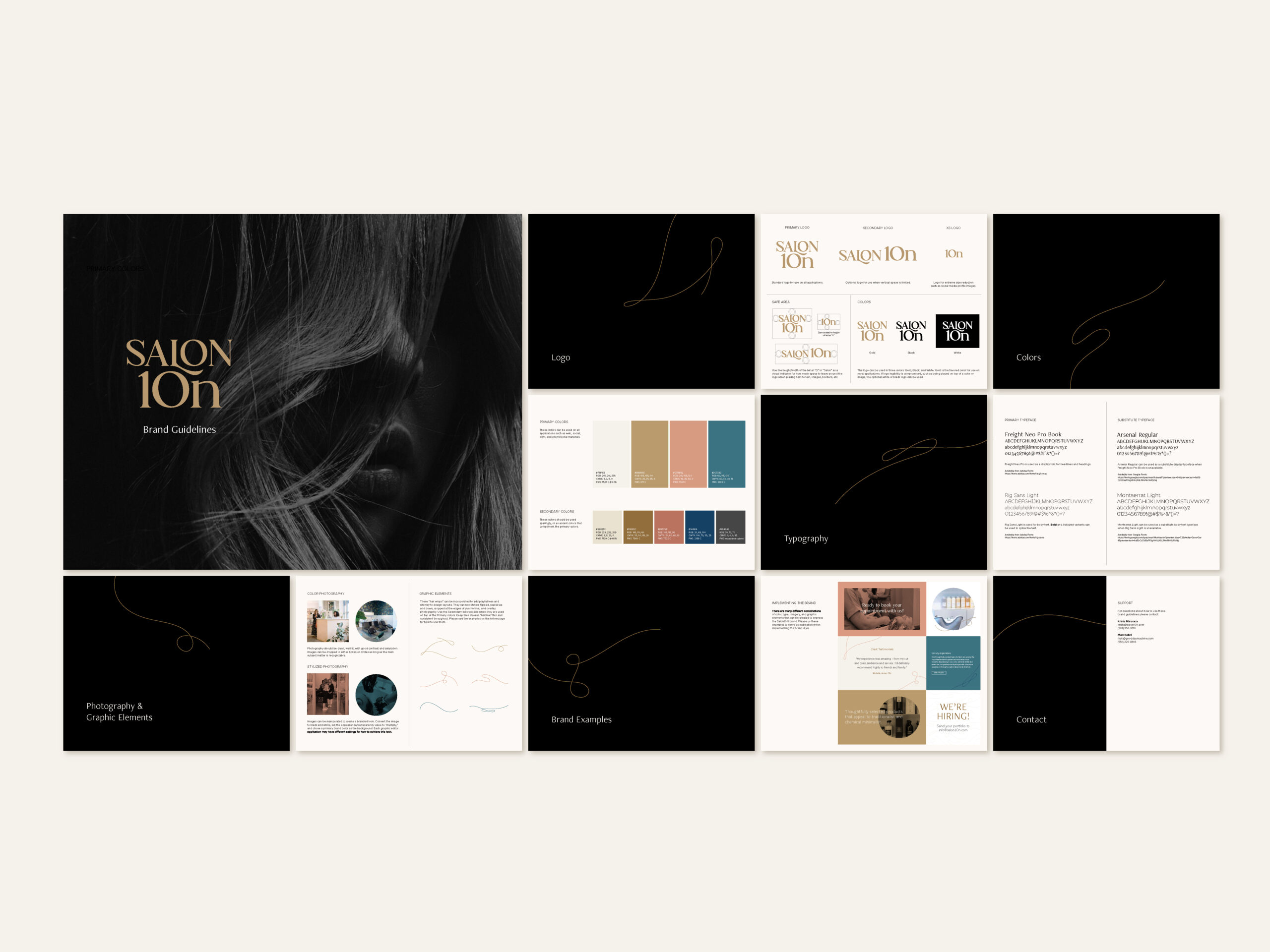
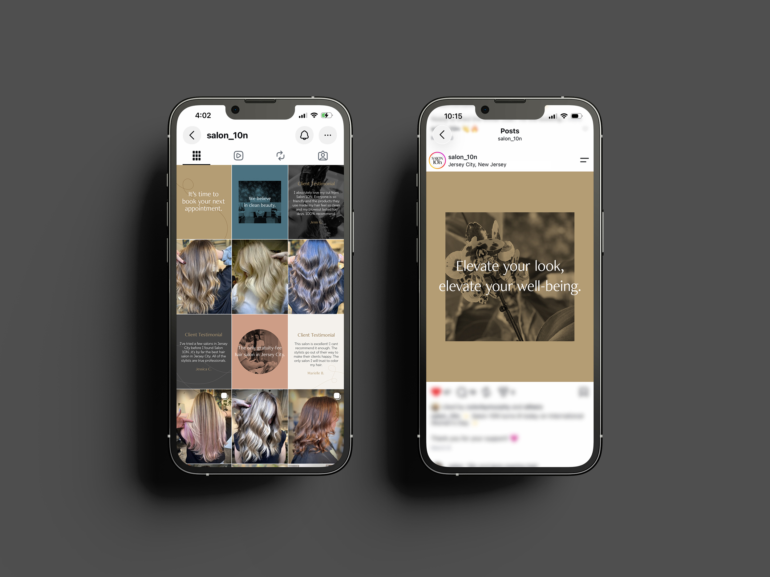
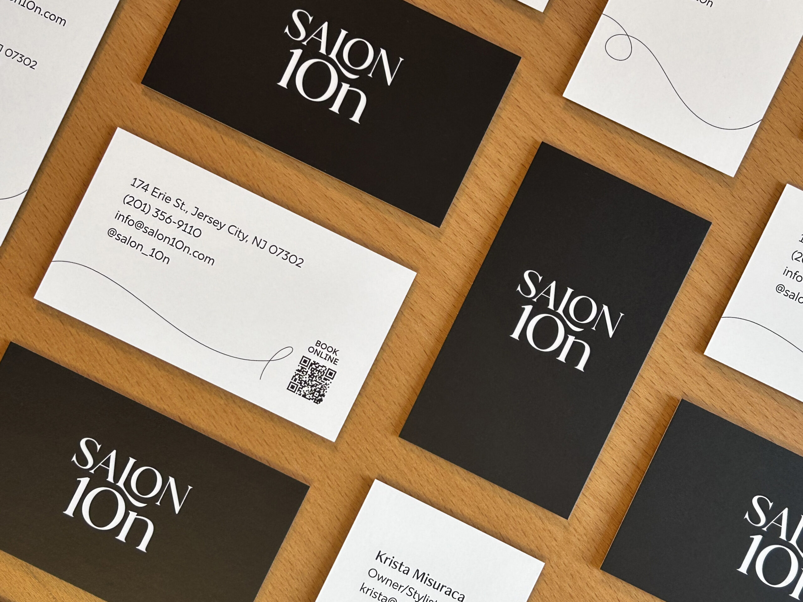
The previous Salon 10N logo used an execution of the letters “L-O-N” that swapped the “LO” to a “10” to create a “10N” that nested within the logotype. This treatment was unsuccessful as it lead many to read the logo as “SALON” and not “SA10N.” The 10N is a pivotal part of the business’s history—the owner’s old apartment number—and the most identifying feature of the business’s name. Placing prominence on the “10N” and adding a gentle swash to the letter “L” creates a flow of hair that “cradles the face.” A natural and rich color palette that is sophisticated and approachable, combined with monochromatic photography and an elegant typeface fortify the brand style.
deliverables
Identity
Website UI
Print Collateral
Apparel
Social
Guest Experience
services
identity design
brand design
art direction
creative direction
website UI design
Client: Salon 10N
Design Agency: Good Day Machine